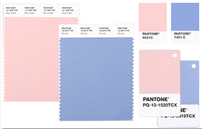
Pantone™s Color(s) of the Year for 2016
If you are working with an interior decorator during your renovation, are a fan of HGTV or just keep up with design trends, you may already know: Pantone, which does so annually, has picked the color (s) for 2016.
What is the Pantone Color of the Year? A symbolic color selection; a color snapshot of what we see taking place in our culture that serves as an expression of a mood and an attitude. You will be seeing these hues in paint colors, furnishings, merchandised products for your home, countertops and cabinetry.
This year two colors were picked (they complement each other): Rose Quartz and Serenity (blue).
Here’s what Pantone has to say about their two picks:
“As consumers seek mindfulness and well-being as an antidote to modern day stresses, welcoming colors that psychologically fulfill our yearning for reassurance and security are becoming more prominent. Joined together, Rose Quartz and Serenity demonstrate an inherent balance between a warmer embracing rose tone and the cooler tranquil blue, reflecting connection and wellness as well as a soothing sense of order and peace. Rose Quartz is a persuasive yet gentle tone that conveys compassion and a sense of composure. Serenity is weightless and airy, like the expanse of the blue sky above us, bringing feelings of respite and relaxation even in turbulent times.
Whether in soft or hard surface material, the pairing of Rose Quartz and Serenity brings calm and relaxation. Appealing in all finishes, matte, metallic and glossy, the engaging combo joins easily with other mid-tones including greens and purples, rich browns, and all shades of yellow and pink. Add in silver or hot brights for more splash and sparkle.
In many parts of the world we are experiencing a gender blur as it relates to fashion, which has in turn impacted color trends throughout all other areas of design. This more unilateral approach to color is coinciding with societal movements toward gender equality and fluidity, the consumer’s increased comfort with using color as a form of expression, a generation that has less concern about being typecast or judged and an open exchange of digital information that has opened our eyes to different approaches to color usage.
The prevalent combination of Rose Quartz and Serenity also challenges traditional perceptions of color association … In many parts of the world we are experiencing a gender blur as it relates to fashion, which has in turn impacted color trends throughout all other areas of design. This more unilateral approach to color is coinciding with societal movements toward gender equality and fluidity, the consumer’s increased comfort with using color as a form of expression, a generation that has less concern about being typecast or judged and an open exchange of digital information that has opened our eyes to different approaches to color usage.â€
At Cornerstone Builders, we know many of our customers are interested in making a sanctuary of a master bedroom or a spa-like atmosphere in their bath and perhaps the Pantone Color(s) of the year would be a good choice to use in your remodeling project. Whatever the renovation, kitchen remodeling, bath remodeling or a whole house renovation, please give us a call at 239-244-1917. We are happy to come to your home and give you a free consultation.